As part of our work on the PASTEUR4OA project we have been creating a series of data visualisations using data from ROARMAP. ROARMAP, or the Registry of Open Access Repository Mandates and Policies is a searchable international registry charting the growth of Open Access mandates adopted by universities, research institutions and research funders. Early PASTEUR4OA work involved developing a new classification scheme for the registry allowing users to record and search the held information with far more detail than before. The project has also added over 250 new policy entries to the ROARMAP database, it currently has 725 policies (as of 24th August 2015). Post rebuilding of ROARMAP a policy effectiveness exercise was carried out that examined deposit rates resulting from mandated and non-mandated policies. The exercise highlighted important evidence that shows three specific elements that support effectiveness: a mandatory deposit, a deposit that cannot be waived, and linking depositing with research evaluation. You can read more about these findings (including policy typology and effectiveness and list of further policymaker targets) in the Workpackage 3 report on policy recording exercise.
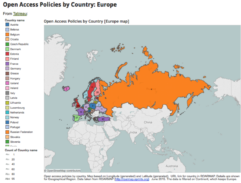
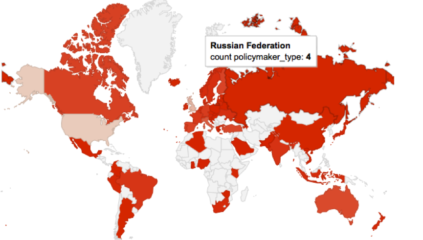
Tableau visualisation of Open Access policies in Europe
While it was agreed that the effectiveness exercise was useful it was recognised that long, comprehensive reports often fail to have the required effect on policy makers. One idea was to carry out some data visualisation work on the ROARMAP data and create both an online data visualisation hub and a series of infographics to feature as part of the advocacy material being developed.
Getting started
I was chosen to lead on the data visualisation work for PASTEUR4OA, but I hadn’t created a series of visualisations like this before. The prospect was a little daunting! However I was lucky enough to have a more experienced colleague whom I could ask for help and bounce ideas around with.
My main brief was to exploit the ROARMAP database and create visuals to be produced for advocates to use in presentations, literature etc. These visuals would show the statistics in attractive and interesting ways, so for example in the form of maps etc. The visualisations would need to be useful for policy makers, institutions, researchers and individuals interested in Open Access. It was also suggested that we use live data when possible.
Some of the questions I asked myself and others prior to starting the work are listed below:
- What is the budget for the work?
- What is the resourcing/time available for the work?
- How will we get the data out of the system it is in? API, URL or other?
- Where will we store the visualisations?
- Where will we store the new data created? Will we release it openly?
- How often will the data be updated?
- Who can help me with my work?
- What is genuinely do-able given my skill set?
There are quite a few guides on the process of data visualisation creation but one that I found particularly useful was this overview from Jan Willem Tulp published on the Visual.ly blog. I also appreciated the clarification of roles in the 8 hats of data visualization design by Andy Kirk.
Early on in the process to make sure that I was thinking about the story we wanted to tell I set up a scratch pad in which to record the questions we wanted to ask of the data. So for example: How many Open Access policies are there worldwide? Can I see this on a map? Which countries have the most policies? How many policies are mandatory? How many comply with the Horizon 2020 OA policy? Does mandating deposit result in more items in repositories? How many policies mention Article Processing Charges? Etc.
We also agreed on the data we would be using:
Experimenting with the Many Eyes tool
Most of the data would be coming from ROARMAP and we worked closely with the ROARMAP developers, and had had significant input into the data on the site, so we were confident that it was reliable. Usually when selecting sources it is useful to keep in mind a couple of questions: is it a reputable source? Is it openly available? Is it easy to get out and work on? Has it been manipulated? Are there omissions of data? Will you need to combine data sets? The ROARMAP site doesn’t have an API but you can get a JSON feed out of the site, or search for data and create excel dumps.
Manipulating data
To begin with I started working on excel dumps from the site. One of the first hurdles I had to jump was getting the country names added to the data. ROARMAP data was categorised using the United Nations geoscheme and the country names were missing. Most of the manipulation could be done in Excel, it is a pretty powerful tool but it requires sensible handling! Some of the useful functions I learnt about include:
- Sum – adding up
- Count – the number of cells in a range that have numbers in them
- Vlookup – lets you search for specific information in your spreadsheet
- Concatenate – lets you combine text from different cells into one cell
- Trim – removes extra spaces
- Substitute – like replace but more versatile
Although you don’t need to be an expert in Excel or Google Spreadsheets it does help if you can use the tool fairly confidently. For me much of the confidence came from being able to manipulate how much data was shown on a sheet or page: so being able to hide rows, lock rows, filter data etc. Less is more – and if there is only the data you need on the page then life becomes a lot easier. Another lesson I learnt early on is the need for regular sanity checks to ensure you are being consistent with data and using the right version of the data set. I kept copious amounts of notes on what I’d done to the data – this proved to be very useful if I wanted to go back and repeat a process. Also I’d suggest that you learn early on how to replace a data set within a tool – you don’t want to get pretty far down the line and not be able to update your data set.
Data visualisation tools
Once I had an idea of which questions needed to be answered…I began to experiment with data visualisation tools. There is a great list of tools available on the datavisualisation.ch site. The main ones I tested out were:
I also experimented with the following infographic tools:
Whilst trialing each of these I had a few questions at the back of my mind:
- How much does it cost to use?
- What type of licence does the tool offer?
- Do I have the correct OS?
- Can we get the visualisation out of the tool?
- Can it link to live data?
- Can we embed the visualisation outside of the site?
- Can we make a graphic of the results?
- Can users download the visualisation, graphic or data?
- Does the tool expect users to be able to programme?
I looked primarily at free services, which obviously have some limitations. Some tools wouldn’t allow me to take the visualisations and embed them elsewhere while others required that I had significant programming skills (in SQL, PHP, Python, R or Matlab) – something I seriously didn’t have time to learn at that point.
Tableau Public came out on top as an all-round tool and I made the decision to stick with one tool for the online visualisations (Tableau public) and one tool for the infographics (here I chose Infogram). Unfortunately both tools didn’t link to live data, in fact none of the free tools seemed to do this in any user-friendly type way.
Linking to live data
Whilst I’ve been working on the data visualisations for PASTEUR4OA the number of Open Access policies that have been submitted to ROARMAP has been increasing. While this is great news for the project it has meant that my data is out of date as quickly as I download it. However I’ve discovered that linking to live data isn’t that easy. Few of the free tools allow it and the best way to create visualisations that do this seems to require programming skills. A colleague of mine helped me pull the JSON feed into a Google spreadsheet and then build a map on top of it but the result is slow to load and not particularly attractive. Linking to live data was going to require better skills than those I possessed – so I asked PASTEUR4OA’s project partner POLITO to help us. Their main work so far has been creating Linked Data SPARQL end points for some Open Access data sets but they have also been experimenting with live data visualisations. You can see an example of their efforts so far in this dynamic ball map.
ROARMAP live data in a Google map
Delivering data visualisations
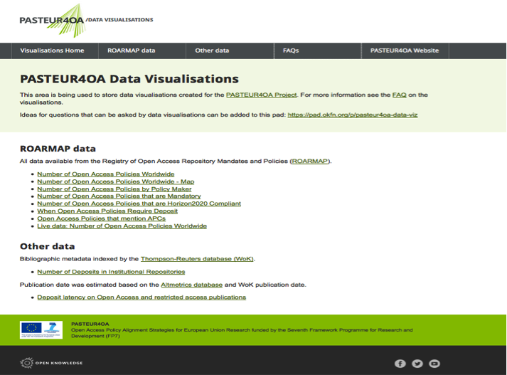
Once I started creating the data visualisations it made sense to have somewhere to store them all. I set up a Github site and worked on a series of pages. Our in-house designer added some PASTEUR4OA styling and the result is available at http://pasteur4oa-dataviz.okfn.org/. The site has information on the questions we have been asking and the data used as well as a FAQ page to explain what the visualisations are for. The visualisations site is linked to from the main menu on the PASTEUR4OA website.
At this point I spent some time thinking about the look and feel of the visualisations. The PASTEUR4OA team suggested we use the ROARMAP colours as a ‘palette’ for the visualisations.
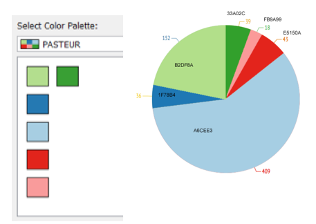
The PASTEUR4OA palette
I also added headings, legends and explanations for the online visualisations to explain what questions they were asking. As part of this work a series of infographics (.png files) have been created from the Infogram visualisations with the intention of using them in blog posts, presentations etc. The images are embedded in the main data visualisation website.
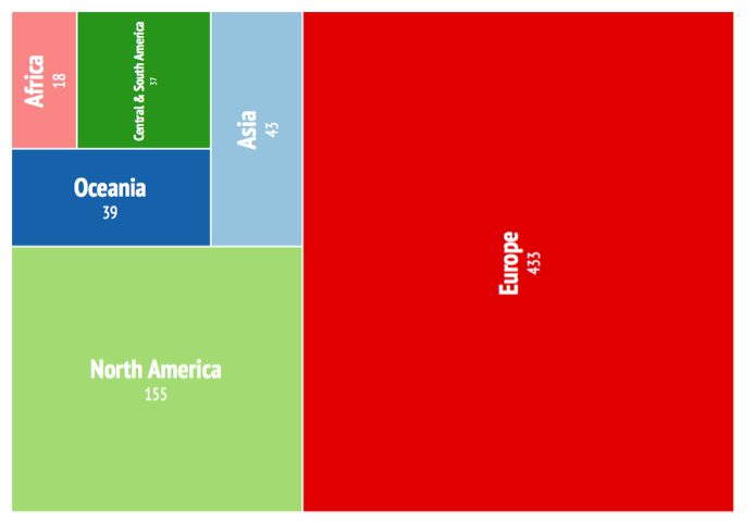
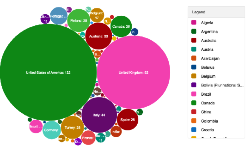
Treemap Infographic of Open Access Policies Worldwide by Continent
Some things I thought about in more detail at this stage:
- What are the infographics going to be used for?
- What format should they be in?
- Is there a colour theme? What colours look good?
- Can I create a custom palette
- Can viewers distinguish between different parts of the chart?
- Is it clear what question the visualisation is answering?
- Is there enough information on the data visualisation?
- Is there a heading, comment box, labels, annotation, legend etc.?
- Is the result honest?
- Document where all the visualisations are held
PASTEUR4OA are also keen to make the data we’d be using openly available so have uploaded versions to Zenodo, a service which allows EU Projects to share and showcase multidisciplinary research results. The data set urls are listed on the data set page on the main visualisation website. Over time we intend to add links from the main data visualisation website to other Open Access open data that believe could be of interest. As mentioned earlier, POLITO will be making some of this data available as linked data. The idea is that developers can use the work we’ve done as ‘proof of concept’ or inspiration and build more visualisations using the data available.
Conclusion
Through carrying out this piece of work for PASTEUR4OA I have learnt many significant lessons about the data visualisation process. Hopefully this blog post has provided a taster of the challenges and benefits such a process brings. As a newbie it wasn’t always easy, but it was certainly interesting and rewarding. If you are thinking about making your own visualisations you might find this complimentary slideset I have created useful.
I believe that the results collected on the PASTEUR4OA data visualisation website are an example of the kind of things those wishing to advocate for Open Access could do without any programming skills. They are there to inspire people, developers, researchers and those new to visualisation and interested in Open Access. It would be great to see some of the visual aids we’ve created in presentations, posters and articles – maybe they can make the (at times!) dry data we were given interesting and accessible.
References
The PASTEUR4OA Data Visualisations website
 Open Access Working Group