Sharing the results of publicly funded research

You are browsing the archive for Projects.

PASTEUR4OA Briefing Paper on the disciplinary differences in opening research data

- April 25, 2016 in PASTEUR4OA, researchdata

The PASTEUR4OA project has produced a series of advocacy resources that can be used by stakeholders to promote the development and reinforcement of Open Access policies when developing new policies or revising existing ones. A new briefing paper, written by Open Knowledge, sheds light on the possibilities and challenges of opening research data in different academic disciplines.

Funders, academic institutions, journals and data service providers adopt open access policies including the publication of data underlying research results. While these mandates are an important step towards open science, they often neglect that there is no ‘one-size-fits-all’ approach to open research data across academic disciplines. Different disciplines produce different types of data and have various procedures for analysing, archiving and publishing it. Some have established data management procedures, norms or policies, making their research data open by default, while others do not. Consequently the Research Information Network (RIN) states in a report that

‘if the policies and strategies of research funders, universities and service providers are to be effective in optimising the use and exchange of scholarly information, they must be sensitive to the practices and cultures of different research communities.’

This briefing paper presents the current state of open research data across academic disciplines. It describes disciplinary characteristics inhibiting a larger take-up of open research data mandates. These characteristics include data management practices, disciplinary norms of data sharing, career-related factors, infrastructural factors, and legal and ethical questions of public access, Additionally, the paper presents the current strategies and policies established by funders, institutions, journals and data service providers alongside general data policies. It can be found on the website of PASTEUR4OA.

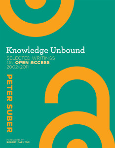
New Open Access Book – ‘Knowledge Unbound: Selected Writings on Open Access, 2002–2011’ by Peter Suber

- April 6, 2016 in PASTEUR4OA

Peter Suber is one of the leading figures in the open access movement and current director of the Harvard Office for Scholarly Communication. Last week saw the publication of his most recent book Knowledge Unbound: Selected Writings on Open Access, 2002–2011 published by MIT Press. The book is available to freely read and download in a range of formats from the publisher’s website with a foreword by Robert Darnton.

Back in 2001, while still a professor of philosophy at Earlham College, Suber undertook a sabbatical from his teaching duties mainly with the intention of focusing on his academic research. During this time, he became increasingly interested in the web’s power for sharing scholarly writing, starting his own weekly newsletter on the subject. As the popularity of the newsletter rapidly grew, so too did Suber’s interest in open access, leading him to spend ‘every hour of my work day, plus many other hours’ working on the topic. The newsletter soon became a blog entitled ‘Open Access News’, from which most of the book’s contents are taken. Suber left Earlham in 2003 and has worked full-time on open access ever since.9780262029902

The book covers Suber’s writings from the early days of the newsletter through to 2011 – a time of huge change for open access to knowledge across the world. During this time, open access went from being an extremely niche activity to something that is near impossible for the average researcher to ignore. The book features sections on the case for OA, understandings of OA, disciplinary differences and what the future might hold, all written in an approachable and conversational style.

For policymakers, there is a whole section on funder and university policies for open access that contextualises Suber’s excellent guide (co-authored with his colleague Stuart Shieber) on Good Practices for University Open-Access Policies. Harvard’s 2008 open-access policy was the first OA policy in an American university and the first faculty-led (rather than administrator-led) policy.

Coupled with his concise introductory 2012 book Open Access (also MIT Press) the two works should offer an excellent introduction and a compelling case for open access publishing.

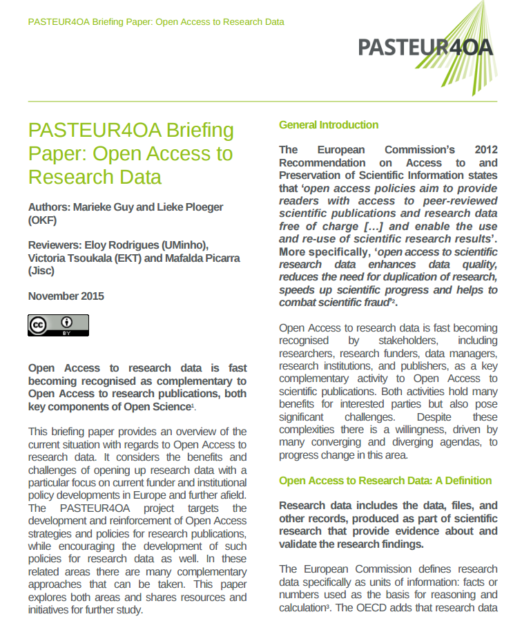
PASTEUR4OA Briefing Paper on Open Access to Research Data

- November 16, 2015 in PASTEUR4OA, Policy, Projects, researchdata

The PASTEUR4OA project has produced a series of advocacy resources that can be used by stakeholders to promote the development and reinforcement of Open Access policies when developing new policies or revising existing ones. Last week a new briefing paper was added, written by Open Knowledge, around the topic of opening up research data.

Open Access to research data is fast becoming recognised as complementary to Open Access to research publications, both key components of Open Science. While the PASTEUR4OA project targets the development and reinforcement of Open Access strategies and policies for research publications, the project also encourages the development of such policies for research data

This briefing paper provides an overview of the current situation with regards to Open Access to research data. It considers the benefits and challenges of opening up research data with a particular focus on current funder and institutional policy developments in Europe and further afield and shares resources and initiatives for further study. The paper is available from http://www.pasteur4oa.eu/resources.

researchdata_brief

Celebrating Open Access Week with PASTEUR4OA Advocacy Resources

- October 19, 2015 in PASTEUR4OA

Today is the first day of the 8th Open Access (OA) week, a global event taking place from 19-25 October that highlights all things open access. In light of this event, we share with you the latest outcome of the PASTEUR4OA project in which Open Knowledge is participating, a set of advocacy resources for policymakers and open access stakeholders.

The PASTEUR4OA project aims to increase national and institutional policymakers’ as well as research funders understanding and awareness of Open Access (OA). PASTEUR4OA also aims to help develop and/or reinforce OA strategies and policies at a national, university and research funder levels that align with the European Commission’s 2012 Recommendation on Access to and Preservation of Scientific Information and the Open Access Mandate for Horizon 2020pasteur

The project also aims to facilitate coordination among all EU Member States and Aligned Countries by establishing a network of expert organisations across Europe – Knowledge Net – and by collaboratively developing a programme of activities that support policymaking at the national, university and funder levels. Open Knowledge participates as a partner in the project both to strengthen our existing Open Access community and to help increase engagement between our community and policy makers across the EU.

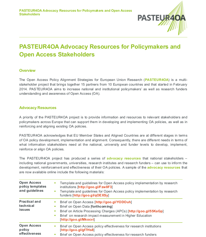
To promote the development and reinforcement of OA policies, PASTEUR4OA has produced a series of advocacy resources that can be used by stakeholders developing new policies or revising existing ones.

pasteur40a_adv res

This new flyer describes the objectives of the PASTEUR4OA project and outlines the advocacy resources that are available for policymakers and OA stakeholders. More information on these resources is also available on the PASTEUR4OA website.


PASTEUR4OA Data Visualisations

- August 26, 2015 in PASTEUR4OA

As part of our work on the PASTEUR4OA project we have been creating a series of data visualisations using data from ROARMAP. ROARMAP, or the Registry of Open Access Repository Mandates and Policies is a searchable international registry charting the growth of Open Access mandates adopted by universities, research institutions and research funders.  Early PASTEUR4OA work involved developing a new classification scheme for the registry allowing users to record and search the held information with far more detail than before. The project has also added over 250 new policy entries to the ROARMAP database, it currently has 725 policies (as of 24th August 2015). Post rebuilding of ROARMAP a policy effectiveness exercise was carried out that examined deposit rates resulting from mandated and non-mandated policies. The exercise highlighted important evidence that shows three specific elements that support effectiveness: a mandatory deposit, a deposit that cannot be waived, and linking depositing with research evaluation.  You can read more about these findings (including policy typology and effectiveness and list of further policymaker targets) in the Workpackage 3 report on policy recording exercise.
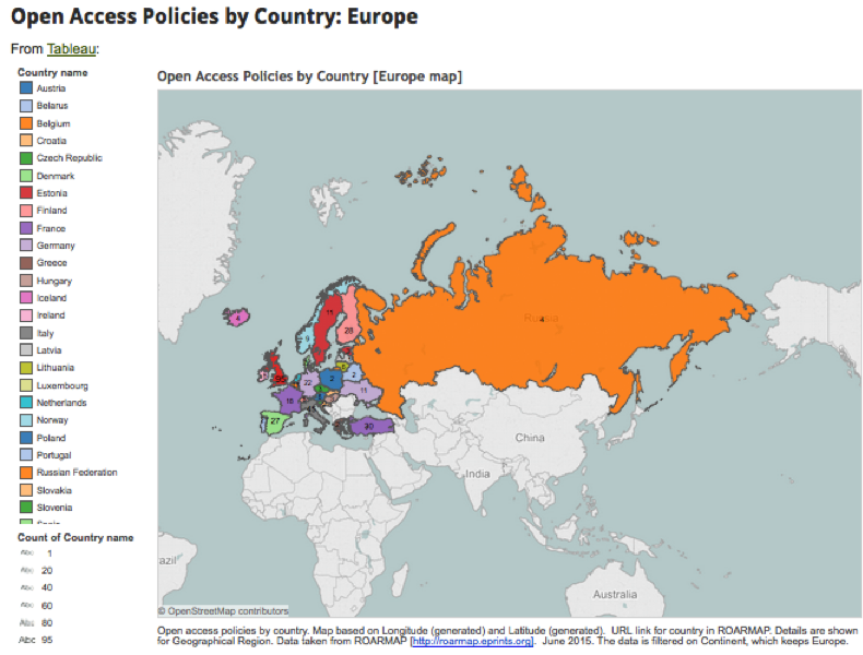
Tableau visualisation of Open Access policies in Europe

Tableau visualisation of Open Access policies in Europe

While it was agreed that the effectiveness exercise was useful it was recognised that long, comprehensive reports often fail to have the required effect on policy makers. One idea was to carry out some data visualisation work on the ROARMAP data and create both an online data visualisation hub and a series of infographics to feature as part of the advocacy material being developed.

Getting started

I was chosen to lead on the data visualisation work for PASTEUR4OA, but I hadn’t created a series of visualisations like this before. The prospect was a little daunting! However I was lucky enough to have a more experienced colleague whom I could ask for help and bounce ideas around with.

My main brief was to exploit the ROARMAP database and create visuals to be produced for advocates to use in presentations, literature etc. These visuals would show the statistics in attractive and interesting ways, so for example in the form of maps etc. The visualisations would need to be useful for policy makers, institutions, researchers and individuals interested in Open Access. It was also suggested that we use live data when possible.

Some of the questions I asked myself and others prior to starting the work are listed below:

  • What is the budget for the work?
  • What is the resourcing/time available for the work?
  • How will we get the data out of the system it is in? API, URL or other?
  • Where will we store the visualisations?
  • Where will we store the new data created? Will we release it openly?
  • How often will the data be updated?
  • Who can help me with my work?
  • What is genuinely do-able given my skill set?

There are quite a few guides on the process of data visualisation creation but one that I found particularly useful was this overview from Jan Willem Tulp published on the Visual.ly blog. I also appreciated the clarification of roles in the 8 hats of data visualization design by Andy Kirk.

Early on in the process to make sure that I was thinking about the story we wanted to tell I set up a scratch pad in which to record the questions we wanted to ask of the data. So for example: How many Open Access policies are there worldwide? Can I see this on a map? Which countries have the most policies? How many policies are mandatory? How many comply with the Horizon 2020 OA policy? Does mandating deposit result in more items in repositories? How many policies mention Article Processing Charges? Etc.

We also agreed on the data we would be using:
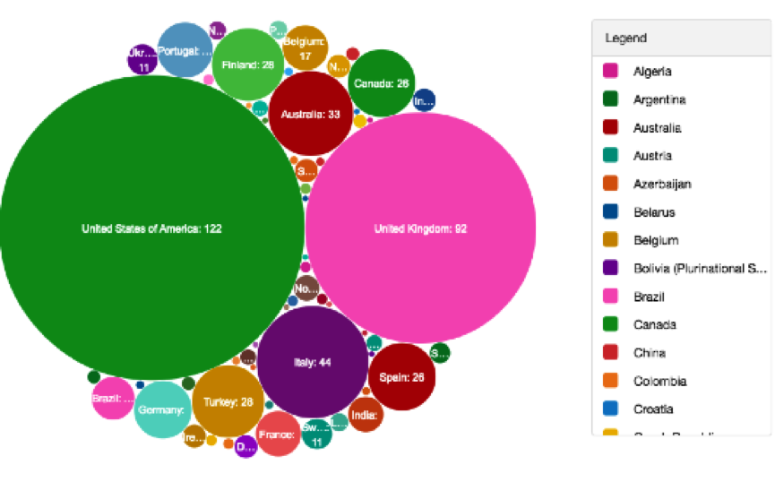
Experimenting with the Many Eyes tool

Experimenting with the Many Eyes tool

Most of the data would be coming from ROARMAP and we worked closely with the ROARMAP developers, and had had significant input into the data on the site, so we were confident that it was reliable. Usually when selecting sources it is useful to keep in mind a couple of questions: is it a reputable source? Is it openly available? Is it easy to get out and work on? Has it been manipulated? Are there omissions of data? Will you need to combine data sets? The ROARMAP site doesn’t have an API but you can get a JSON feed out of the site, or search for data and create excel dumps.

Manipulating data

To begin with I started working on excel dumps from the site. One of the first hurdles I had to jump was getting the country names added to the data. ROARMAP data was categorised using the United Nations geoscheme and the country names were missing. Most of the manipulation could be done in Excel, it is a pretty powerful tool but it requires sensible handling! Some of the useful functions I learnt about include:

  • Sum – adding up
  • Count – the number of cells in a range that have numbers in them
  • Vlookup – lets you search for specific information in your spreadsheet
  • Concatenate – lets you combine text from different cells into one cell
  • Trim – removes extra spaces
  • Substitute – like replace but more versatile

Although you don’t need to be an expert in Excel or Google Spreadsheets it does help if you can use the tool fairly confidently. For me much of the confidence came from being able to manipulate how much data was shown on a sheet or page: so being able to hide rows, lock rows, filter data etc. Less is more – and if there is only the data you need on the page then life becomes a lot easier. Another lesson I learnt early on is the need for regular sanity checks to ensure you are being consistent with data and using the right version of the data set. I kept copious amounts of notes on what I’d done to the data – this proved to be very useful if I wanted to go back and repeat a process. Also I’d suggest that you learn early on how to replace a data set within a tool – you don’t want to get pretty far down the line and not be able to update your data set.

Data visualisation tools

Once I had an idea of which questions needed to be answered…I began to experiment with data visualisation tools. There is a great list of tools available on the datavisualisation.ch site. The main ones I tested out were:

I also experimented with the following infographic tools:

Whilst trialing each of these I had a few questions at the back of my mind:

  • How much does it cost to use?
  • What type of licence does the tool offer?
  • Do I have the correct OS?
  • Can we get the visualisation out of the tool?
  • Can it link to live data?
  • Can we embed the visualisation outside of the site?
  • Can we make a graphic of the results?
  • Can users download the visualisation, graphic or data?
  • Does the tool expect users to be able to programme?

I looked primarily at free services, which obviously have some limitations. Some tools wouldn’t allow me to take the visualisations and embed them elsewhere while others required that I had significant programming skills (in SQL, PHP, Python, R or Matlab) – something I seriously didn’t have time to learn at that point.

Tableau Public  came out on top as an all-round tool and I made the decision to stick with one tool for the online visualisations (Tableau public) and one tool for the infographics (here I chose Infogram). Unfortunately both tools didn’t link to live data, in fact none of the free tools seemed to do this in any user-friendly type way.

Linking to live data

Whilst I’ve been working on the data visualisations for PASTEUR4OA the number of Open Access policies that have been submitted to ROARMAP has been increasing. While this is great news for the project it has meant that my data is out of date as quickly as I download it. However I’ve discovered that linking to live data isn’t that easy. Few of the free tools allow it and the best way to create visualisations that do this seems to require programming skills. A colleague of mine helped me pull the JSON feed into a Google spreadsheet and then build a map on top of it but the result is slow to load and not particularly attractive. Linking to live data was going to require better skills than those I possessed – so I asked PASTEUR4OA’s project partner POLITO to help us. Their main work so far has been creating Linked Data SPARQL end points for some Open Access data sets but they have also been experimenting with live data visualisations. You can see an example of their efforts so far in this dynamic ball map.
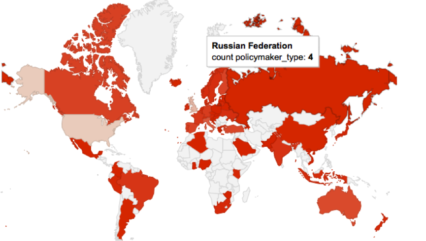
ROARMAP live data in a Google map

ROARMAP live data in a Google map

Delivering data visualisations

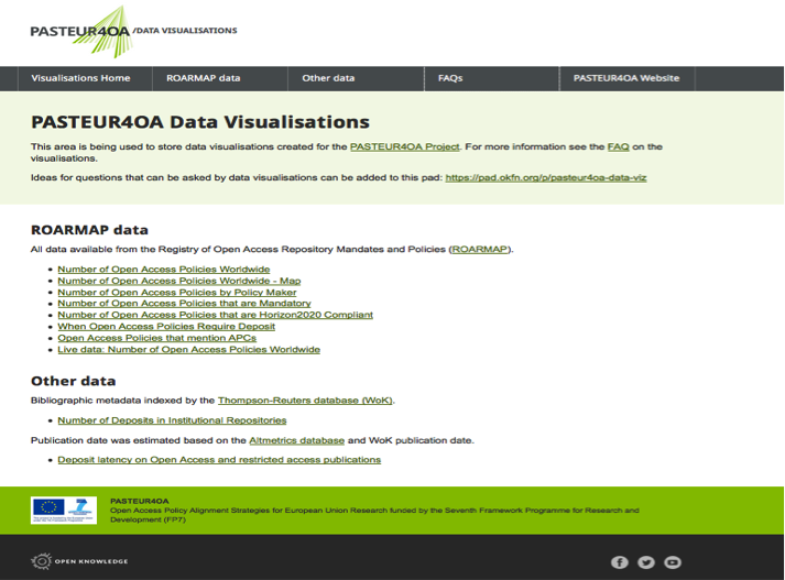
Once I started creating the data visualisations it made sense to have somewhere to store them all. I set up a Github site and worked on a series of pages. Our in-house designer added some PASTEUR4OA styling and the result is available at http://pasteur4oa-dataviz.okfn.org/. The site has information on the questions we have been asking and the data used as well as a FAQ page to explain what the visualisations are for. The visualisations site is linked to from the main menu on the PASTEUR4OA website.

At this point I spent some time thinking about the look and feel of the visualisations. The PASTEUR4OA team suggested we use the ROARMAP colours as a ‘palette’ for the visualisations.
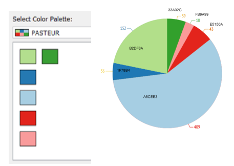
The PASTEUR4OA palette

The PASTEUR4OA palette

I also added headings, legends and explanations for the online visualisations to explain what questions they were asking. As part of this work a series of infographics (.png files) have been created from the Infogram visualisations with the intention of using them in blog posts, presentations etc. The images are embedded in the main data visualisation website.
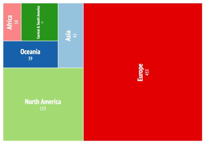
Treemap Infographic of Open Access Policies Worldwide by Continent

Treemap Infographic of Open Access Policies Worldwide by Continent

Some things I thought about in more detail at this stage:

  • What are the infographics going to be used for?
  • What format should they be in?
  • Is there a colour theme? What colours look good?
  • Can I create a custom palette
  • Can viewers distinguish between different parts of the chart?
  • Is it clear what question the visualisation is answering?
  • Is there enough information on the data visualisation?
  • Is there a heading, comment box, labels, annotation, legend etc.?
  • Is the result honest?
  • Document where all the visualisations are held

PASTEUR4OA are also keen to make the data we’d be using openly available so have uploaded versions to Zenodo, a service which allows EU Projects to share and showcase multidisciplinary research results. The data set urls are listed on the data set page on the main visualisation website. Over time we intend to add links from the main data visualisation website to other Open Access open data that believe could be of interest. As mentioned earlier, POLITO will be making some of this data available as linked data. The idea is that developers can use the work we’ve done as ‘proof of concept’ or inspiration and build more visualisations using the data available.

Conclusion

Through carrying out this piece of work for PASTEUR4OA I have learnt many significant lessons about the data visualisation process. Hopefully this blog post has provided a taster of the challenges and benefits such a process brings. As a newbie it wasn’t always easy, but it was certainly interesting and rewarding. If you are thinking about making your own visualisations you might find this complimentary slideset I have created useful.

I believe that the results collected on the PASTEUR4OA data visualisation website are an example of the kind of things those wishing to advocate for Open Access could do without any programming skills. They are there to inspire people, developers, researchers and those new to visualisation and interested in Open Access. It would be great to see some of the visual aids we’ve created in presentations, posters and articles – maybe they can make the (at times!) dry data we were given interesting and accessible.

References
The PASTEUR4OA Data Visualisations website

The PASTEUR4OA Data Visualisations website

PASTEUR4OA announces Regional Policy Workshops

- July 24, 2015 in PASTEUR4OA

The PASTEUR4OA Project has announced a series of regional Open Access policy workshops for research funders and research performing organisations. The regional meetings will take place between September 2015 and April 2016 in Spain, Hungary, Greece, Belgium, Italy, Turkey and in the Nordic countries in collaboration with the Rectors’ Conference and the Nordic Council of Ministers (the location TBA).

pasteurlogo

The participants will exchange ideas and policy practices and discuss concrete actions to improve existing or develop new Open Access policies aligned with the European Commission’s Recommendation to Member States of July 2012 and the Horizon 2020 Open Access requirements. The agendas of these regional workshops will be tailored to the specific needs of the respective target groups (funders or universities/research centers) and the level of Open Access policy development in the region.

The regional workshops will take place on:

  • September 28, 2015 in Madrid, Spain: The regional workshop for research funders from the South-West region (Italy, Malta, Portugal and Spain), contact person: Clara Parente Boavida (claraboavida@sdum.uminho.pt);
  • October 29 and 30, 2015 in Budapest, Hungary: The regional workshops for research funders and research performing organizations from the Eastern Europe (Croatia, Czech Republic, Estonia, Hungary, Latvia, Lithuania, Poland, Romania, Slovakia and Slovenia): http://openaccess.mtak.hu/meeting;
  • November 4, 2015 in Athens, Greece: The regional workshop for research performing organizations from the South-East region (Bulgaria, Cyprus, Greece, Macedonia, Serbia and Turkey), contact person: Victoria Tsoukala (tsoukala@ekt.gr);
  • February 9 and 10, 2016 in Brussels, Belgium: The regional workshops for research funders and research performing organizations from the North-West region (Austria, Belgium, France, Germany, Ireland, Luxembourg, the Netherlands and the UK) in collaboration with Science Europe and the European University Association, contact person: Alma Swan (almaswan3@gmail.com);
  • February 22, 2016 in Turin, Italy: The regional workshop for research performing organizations from the South-West region (Italy, Malta, Portugal and Spain), contact person: Clara Parente Boavida (claraboavida@sdum.uminho.pt);
  • March/April 2016: The regional workshops for research funders and research performing organizations from the Nordic region (Denmark, Finland, Iceland, Sweden and Norway) in collaboration with Rectors’ conference and the Nordic Council of Ministers, contact person: Nina Karlstrøm (nina.karlstrom@cristin.no);
  • April 1, 2016 in Istanbul, Turkey: The regional workshop for research funders from the South-East region (Bulgaria, Cyprus, Greece, Macedonia, Serbia and Turkey), contact person: Victoria Tsoukala (tsoukala@ekt.gr).

For further details see the PASTEUR4OA website.

Open Access HSS Tweets!

- July 23, 2015 in OpenAccessHSS

A new Twitter account curated by Martin Eve, Senior Lecturer in Literature, Technology and Publishing at Birkbeck, University of London, and Jonathan Gray, Director of Policy & Research at Open Knowledge, will share news, resources and debates about Open Access in the Humanities and Social Sciences (HSS).

HSS

The account will support the Future of Scholarship Project which aims to build a stronger, better connected network of people interested in open access in the humanities and social sciences.

The Twitter account is available at @OpenAccessHSS. Get following!

Introducing ContentMine

- July 20, 2015 in Guest Post, Projects

contentmine2ContentMine aims to liberate 100,000,000 facts from the scientific literature.

We believe that “The Right to Read is the Right to Mine“: anyone who has lawful access to read the literature with their eyes should be able to do so with a machine.

We want to make this right a reality and enable everyone to perform research using humanity’s accumulated scientific knowledge. The extracted facts are CC0.

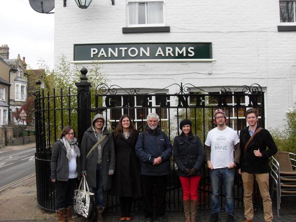
The Content Mine Team at the Panton Arms in Cambridge

The ContentMine Team & Helen Turvey, Executive Director, Shuttleworth Foundation at the Panton Arms in Cambridge

Research which relies on aggregating large amounts of dynamic information to benefit society is particularly key to our work – we want to see the right information getting to the right people at the right time and work with professionals such as clinical trials specialists and conservationists. ContentMine tools, resources, services and content are fully Open and can be re-used by anybody for any legal purpose.

ContentMine is inspired by the community successes of Wikimedia, Open StreetMap, Open Knowledge, and others and encourages the growth of subcommunities which design, implement and pursue their particular aims. We are funded by the Shuttleworth Foundation, a philanthropic organisation who are unafraid to re-imagine the world and fund people who’ll change it.

Content Mine welcome session

ContentMine Wellcome Trust Workshop

There are several ways to get involved with ContentMine. You can find us on GitHub, Google Groups, email, Twitter and most recently, we have a variety of open communities set up here on Discourse.

Research Impact Measurement – Timeline

- June 10, 2015 in PASTEUR4OA

I’ve been working on a series of timelines for the PASTEUR4OA Project – these will form part of a collection of advocacy papers. So far we’ve had one on Article Processing Charges (APCs) and on Open Access to Research Data. I now have a final timeline to share with you on Research Impact Measurement and Peer review. So bibliometrics, altmetrics, research evaluation and other related areas.

Image from Pixabay, CC0

Image from Pixabay, CC0

This timeline has used What is Open Peer Review as its foundation. Once again any suggestions would be much appreciated.

1665

20th century – Peer review became common for science funding allocations.

1948

  • Launch of Project RAND, an organization formed immediately after World War II to connect military planning with research and development decisions. The project evolved into the RAND Corporation is a nonprofit institution that helps improve policy and decision making through research and analysis. [http://www.rand.org/]

1955

1961

1969

1976

1986

  • First exercise of assessing of research in Higher Education in the UK took place conducted by the University Grants Committee, a predecessor of the present Higher Education Funding Councils. Went on to be carried out in 1992, 1996, 2001 and 2008.

1989

1996

  • Michael Power writes The Audit Explosion – an anti auditing and measuring paper. [http://www.demos.co.uk/files/theauditexplosion.pdf]
  • PageRank was developed at Stanford University by Larry Page and Sergey Brin
  • CiteSeer goes public – first such algorithm for automated citation extraction and indexing

1998

  • PageRank is introduced to Google search engine

1999

2000

2001

  • Atmospheric Chemistry and Physics introduces a system where manuscripts are placed online as a “discussion paper”, which is archived with all comments and reviews, even before approved and peer-reviewed articles appear in the journal.

2002

2004

  • The official U.S. launch of Scopus was held at the New York Academy of Sciences. [http://www.scopus.com/]
  • BMJ published the number of views for its articles, which was found to be somewhat correlated to citations
  • Google Scholar index launched

2005

2006

2007

2008

  • European Commission, DG Research set up the Expert Group on Assessment of University-Based Research to identify the framework for a new and more coherent methodology to assess the research produced by European universities.
  • Last Research Assessment Exercise (RAE) run in UK
  • The MRC launch a new online approach to gather feedback from researchers about the output from their work, first called the “Outputs Data Gathering Tool”, it is revised and renamed “MRC eVal” in 2009 and then re-developed as “Researchfish” in 2012. [http://www.mrc.ac.uk/research/achievements/evaluation-programme/?nav=sidebar]
  • The MRC, Wellcome Trust and Academy of Medical Sciences publish the first “Medical Research: What’s it worth?” analysis the result of two years of discussion under the auspices of the UK Evaluation Forum, and ground-breaking analysis by the Health Economics Research Group at Brunel, RAND Europe and the Office of Health Economics. The findings provide a new UK estimate of the return on investment from medical research. [http://www.mrc.ac.uk/news-events/publications/medical-research-whats-it-worth/]

2009

  • Public Library of Science introduced article-level metrics for all articles.
  • UK research councils introduce “pathways to impact” as a major new section in all RCUK applications for funding. Applicants are asked to set out measures taken to maximise impact. [http://www.rcuk.ac.uk/innovation/impacts/]

2010

2011

2012

  • Google scholar adds the possibility for individual scholars to create personal “Scholar Citations profiles”
  • Several journals launch with an open peer review model:
    • GigaScience – publishes pre-publication history with articles and names reviewers (opt-out system)
    • PeerJ – Peer review reports published with author approval, reviewer names published with reviewer permission. (Info)
    • eLife Decision letter published with author approval. Reviewers anonymous.
    • F1000Research – All peer review reports and reviewer names are public, and appear after article is published online.
  • MRC launches a new funding initiative for studies aimed at better understanding the link between research and impact over the next two years 7 awards are made totaling £1M. [http://www.mrc.ac.uk/funding/how-we-fund-research/highlight-notices/economic-impact-highlight-notice/]
  • Subset of higher education institutions in Australia ran a small-scale pilot exercise to assess impact and understand the potential challenges of the process: the Excellence in innovation for Australia impact assessment trial (EIA). [https://go8.edu.au/programs-and-fellowships/excellence-innovation-australia-eia-trial]
  • ORCID launches its registry and begins minting identifiers

2013

2014

2015

  • 100 research funding organisations are using Researchfish in the UK, tracking the progress and productivity of more than £4.5billion of funding for new grants each year.

Visualisations of OA Policies that offer APC grants

- May 21, 2015 in PASTEUR4OA, Projects

As mentioned previously Open Knowledge are project partners on the PASTEUR4OA Project. To compliment our briefing paper work we will be creating a series of Data Visualisations that will be available online and a series of infographics that can be used in advocacy materials. These visualisations will build on data from ROARMAP – a registry of OA policies.

I am no expert in data visualisation and am very much learning as I go along. I hope to share my experiences in creating the visualisations later down the line. Today I have been working with Tableau Public and have produced a number of different visualisations. With APCs in mind (you may have seen the APC timeline we have been collating) here is an attempt at a visualisation of Open Access Policies (by country) that offer some form of APC grant.

Any feedback welcome – I’m still learning so please be gentle!